How to design a website that actually generates leads
The structural decisions that decide whether a visitor makes contact: what goes above the fold, how much proof is enough, and where forms lose people.
Entrovix AIAug 12, 2026 11 min read
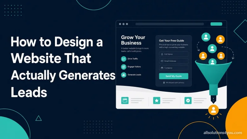
A website that generates leads is not a prettier version of one that does not. The differences are structural, and most of them are decisions made before anybody opens a design tool.
What follows is the set of decisions that matter, in roughly the order they affect the outcome.
Decide what the site is for, in one sentence
Not "represent the brand". A specific action by a specific person: a homeowner in Pune requests a quote for a kitchen. A finance director books a demo. Everything downstream is either serving that sentence or competing with it.
Sites that fail at this stage are usually organised around the company's internal structure rather than around what a visitor is trying to do. A navigation menu that mirrors your org chart is the clearest symptom.
The first screen has three jobs
A visitor arriving from search gives you a few seconds to establish that they are in the right place. In that space you need to answer three questions, and there is no room for a fourth thing.
- 1What is this? Concretely. The specific service, not a category abstraction.
- 2Is it for me? Name the customer. Serving everybody reads as serving nobody.
- 3What do I do next? One action, obvious, and reachable without scrolling on a phone.
| Instead of | Write |
|---|---|
| Innovative digital solutions | Custom web applications for logistics companies |
| Quality you can trust | Kitchen fitting in Pune, with a fixed quote in 48 hours |
| Welcome to our website | Anything at all, including nothing |
| Learn more | Get a fixed quote, or See what a project costs |
The left column is what most sites say. It is not that those words are wrong, exactly. It is that they would be equally true of every competitor, which makes them worth nothing to somebody choosing between you.
Proof, and what counts as proof
Everything a business says about itself is discounted by the reader, correctly. Proof is anything a dishonest competitor could not copy without lying.
| Weak | Strong |
|---|---|
| We deliver quality work | Photographs of the last six projects, with client names |
| Our clients love us | A named testimonial with a job title and a specific outcome |
| Years of experience | The number of projects, and what changed for one of them |
| Trusted by many | Logos you can verify, or none at all |
| 5-star rated | A link to the reviews, so it can be checked |
One specific, checkable, slightly awkward detail is worth more than five polished claims. A case study that mentions what went wrong and how it was handled is more persuasive than one where everything went perfectly, because nothing goes perfectly and readers know it.
Design the form as the most important element
It is where the money is, and it is usually the least considered part of the page. Every field is a small negotiation, and people abandon negotiations.
- Name, contact, and a description of the problem. That is a complete first enquiry for most businesses.
- Never ask for something you will not use in your reply. Budget dropdowns lose more enquiries than they qualify.
- Label fields above the input, not inside as placeholder text that vanishes when someone starts typing.
- Validate as they go, not on submit, and never clear a form on an error.
- Say what happens next: we reply within one working day, with a person's name attached.
- The confirmation is part of the design. A blank page after submitting reads as a failure, and the visitor sends it again or gives up.
One more, easy to miss: make the phone number and email a link. On a phone, a number that cannot be tapped is a number that will not be dialled.
One action per page
Every additional call to action divides attention and reduces the chance that any of them happens. Pick the primary action for each page, repeat it as the page gets longer, and make everything else visibly secondary.
For a campaign page, go further and remove the navigation. Somebody who arrived from an advertisement for one service does not need a menu offering the other eight. That is the whole idea behind a dedicated landing page, and it is why they convert better than sending the same traffic to a homepage.
Build it mobile-first, and mean it
Most visitors are on a phone. Designing on a wide screen and adapting downward produces a phone experience full of compromises, because the compromises all happen at the end when the budget is gone.
- Tap targets big enough for a thumb, with space between them.
- The primary action reachable without scrolling on a small screen.
- No horizontal scrolling, ever. Test at 320px, which is still the narrowest screen in real use.
- Text large enough to read without pinching, which in practice means 16px as a floor.
- Wide tables become cards or scroll inside their own container, so the page never moves sideways.
Speed is a conversion feature
Its effect on rankings is modest. Its effect on whether somebody waits is not. Commercial pages lose visitors fastest, because a person comparing three suppliers has two other tabs open.
Aim for the three field thresholds and then stop: Largest Contentful Paint at 2.5 seconds or less, Interaction to Next Paint at 200 milliseconds or less, Cumulative Layout Shift at 0.1 or less. A page that shifts while loading makes people tap the wrong thing, and on a form that is fatal.
Then measure the thing you actually want
Not sessions. Not bounce rate. Enquiries, and where they came from. Without that, every design decision after launch is an argument between opinions.
- 1Record form submissions as a tracked event, and verify by submitting one yourself.
- 2Track clicks on phone and email links, which are invisible otherwise.
- 3Note which page the visitor entered on, not just which page they converted from.
- 4Review monthly. Weekly numbers on a small site are noise.
What does not matter as much as people think
- Carousels. Visitors interact with the first slide and almost never the rest, so the second slide is a page element nobody sees.
- The exact colour of the button. Contrast and placement matter; the specific hue is where redesigns go to argue.
- Being visually unlike your competitors. Familiar layouts convert well because people know how to use them.
- Page length. A long page that answers the question outperforms a short page that does not, and vice versa. The length is not the variable.
Most sites that do not generate leads are not badly designed. They are well designed around the wrong sentence.
Questions people actually ask
How many pages does a lead-generating site need?
Fewer than most people build. A homepage, a page per service you actually want more of, an about page with real people on it, proof, and contact. Additional pages should exist because a specific search deserves them, not to reach a page count.
Should I publish prices?
Something about price, yes. A starting figure, a typical range, or a worked example. Refusing entirely loses more good enquiries than it filters out bad ones, because people assume the worst and leave.
Do chat widgets help?
When somebody answers them promptly, yes. When they are a bot that cannot answer and nobody monitors, they add page weight and frustration. Measure whether yours produces enquiries before assuming it does.
Is my current site fixable, or does it need rebuilding?
Usually fixable. The exception is a site whose structure is the constraint, where every improvement needs a workaround. Ten signs a website needs rebuilding sets out how to tell.